
True taste is unspoken. It seeps into the fabric of life causing barely a rustle; making just enough noise for you to notice but never stare. Instead, it finds its way into your daily subconscious, and before you can even catch on, you begin to search for it. It’s the subtle glimpse of a Tank Must edging from underneath a crisp white shirt. The unmistakable seal of love, held together by the tightest of bonds. A passing flash of a crimson red box, ever so slightly ajar – the key to life’s answers lying inside. It’s legacy. Timelessness. Communication through design. But above all, it’s knowing who you are and acting without hesitation.
It’s a confidence that jewellery Maison Cartier possesses in spades. Since its inception in 1847, Cartier has never wavered on its loyalty to and respect for strong designs. At the heart of each of its creations lies a dedication to perennity and evolution. A principle that Cartier Oceania’s Managing Director, Alban du Mesnil, says, has contributed to the Maison’s enduring relevance.
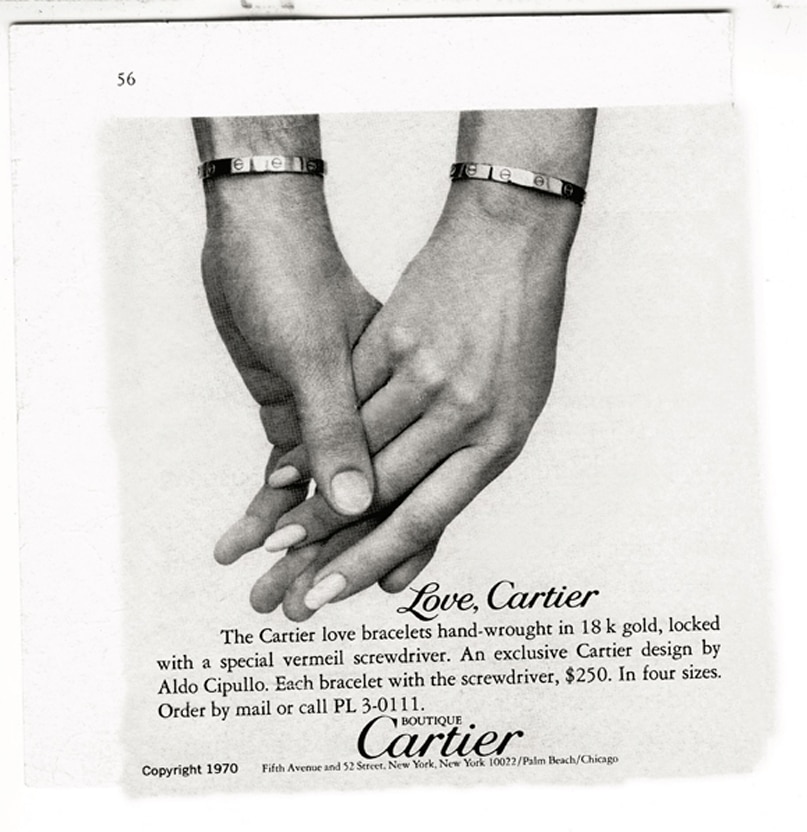
Advertisement for the Love bracelet, designed by Aldo Cipullo for Cartier, Cartier New York, circa 1970. © Cartier
“It’s a path we have always followed. At the same time, it doesn’t mean that we don’t create totally new designs. We respect our dynamic heritage, constantly enriching it by expanding it and pushing boundaries – we ensure all our creations transcend time.”
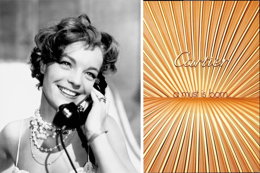
Left: Romy Schneider in 1962. She is wearing her Trinity ring. © Everett Collection / Bridgeman Images. Right: Invitation to the launch party for Les Must de Cartier glasses at Port El Kantaoui, Tunisia, 1983 © Cartier.
“Even when we develop a new design, it has an intrinsic strength that relies on two aspects: the first is perennialism, the fact that it will last for a long time and not the result of an ephemeral trend; and second is that it is strong enough to be able to evolve.”
“It’s a path we have always followed. At the same time, it doesn’t mean that we don’t create totally new designs. We respect our dynamic heritage, constantly enriching it by expanding it and pushing boundaries – we ensure all our creations transcend time.”
This sentiment speaks volumes particularly when looking to Cartier’s Tank watch. A creation birthed from a place of visionary intuition, the story goes that the Maison’s original tastemaker and founder, Louis Cartier, was the one who drew the parallels between the architecture of the watch and the topographic design of a combat vehicle, which would go on to inspire the design we now know as Tank. The Tank watch has since become a hallmark for Cartier’s creative approach; with each iteration amalgamating the purity of the line, the accuracy of the shape, the precision of the proportions, and precious details to create a silhouette that has always felt contemporary beyond its time.
“It is a challenge to reinvent and reinterpret an existing collection – sometimes we say it is more challenging than creating a new design. Many of the decisions we take in terms of design are linked to feelings"
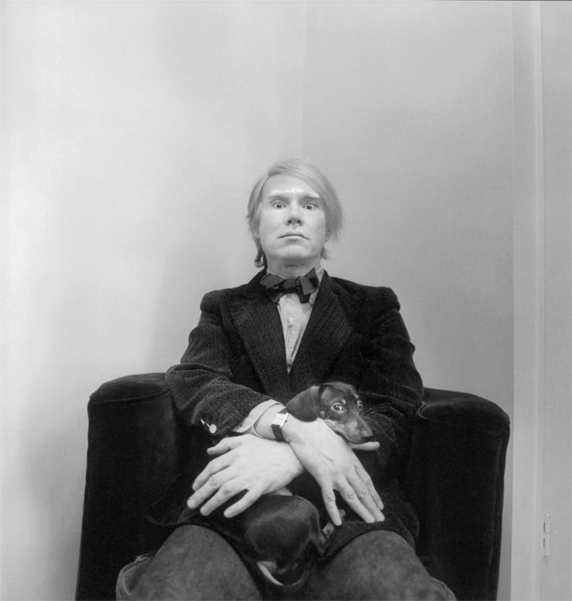
Andy Warhol photographed at his studio by Arnold Newman in February 1973. He is wearing a Tank wristwatch. © Arnold Newman Properties/Getty Images. Used with permission from The Andy Warhol Foundation for the Visual Arts, Inc.
“It is a challenge to reinvent and reinterpret an existing collection – sometimes we say it is more challenging than creating a new design. Many of the decisions we take in terms of design are linked to feelings,” Du Mesnil shares.
The latest offering of the Tank Must is a virtuous circle of design and feeling, reigniting the unique spirit the watch has possessed from the moment it launched in the 1970s. The watch of choice for aesthetes and creatives searching for ultimate elegance, it has found itself on the wrists of some of history’s greatest visionaries. From the formidable Patti Smith to the electric Andy Warhol and the graceful Catherine Deneuve; Cartier and its Tank watch has become as much of an icon as those who wear it.
“For the Tank this year, we felt like reproposing it in a traditional shape like the Louis Cartier, with the softened aspect of it but also with colourful dials from another period. It carries a notion of modern design as it did in the 1970s when it first launched, because of the desire for very pure and simple objects. For this reason, it’s quite difficult to date a Tank watch. If we look at the Tank dating from the beginning of the twentieth century, it is equally as contemporary as today’s version.”
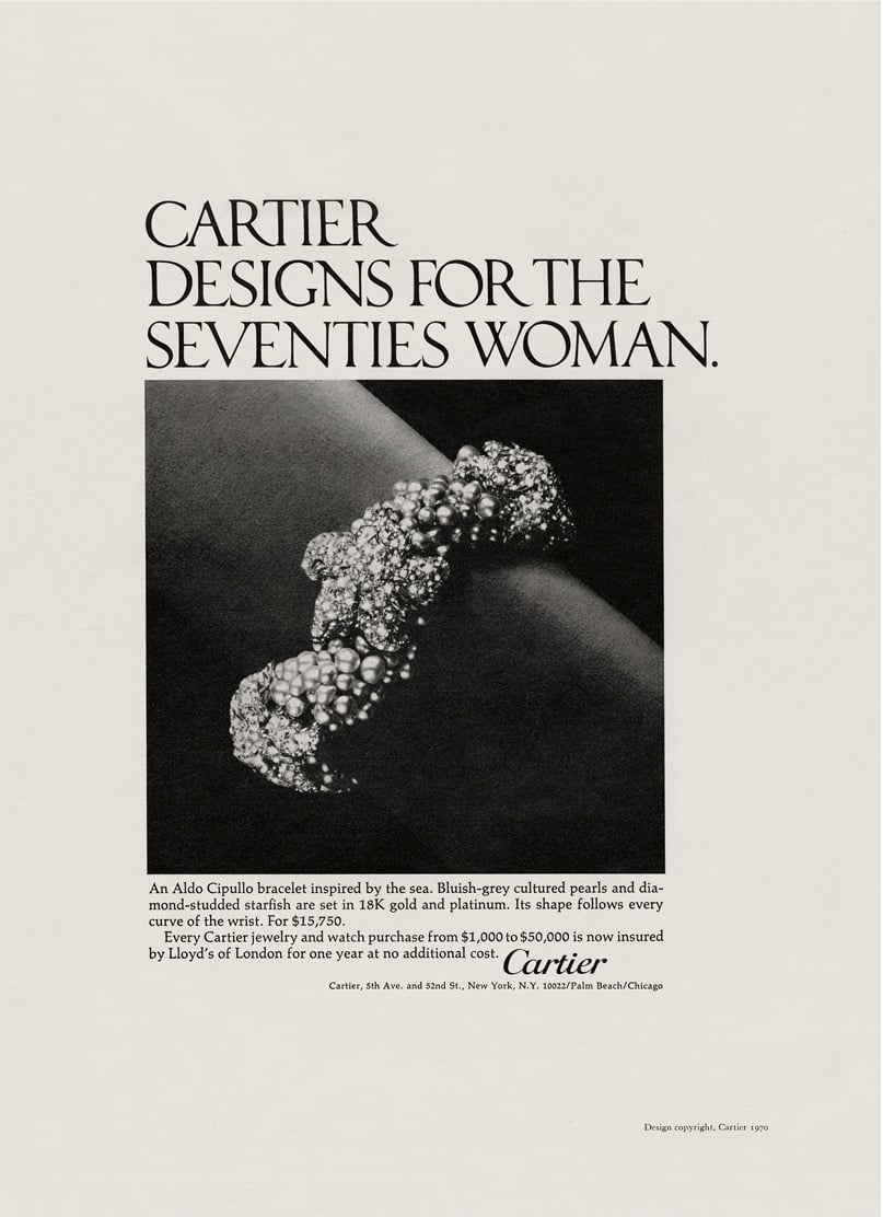
Advertisement for a bracelet, designed by Aldo Cipullo for Cartier, Cartier New York, 1970. Cartier Archives, New York © Cartier.
This fever for ‘creating for tomorrow’ was only magnified when jewellery designer Aldo Cipullo made his mark at the Maison. Unknowingly, his five-year reign would become a period in Cartier’s history that would change the course of the brand forever. Not only did Cipullo unify his unique design vocabulary with Cartier’s unparalleled quality, but his understanding for creating modern and timeless pieces would lead him to design two of the Maison’s signature collections.
Cipullo’s Love and Juste un Clou burst onto the scene in 1969 and 1971 respectively, radicalising everything one previously understood about jewellery. Androgynous, unisex and with just the right hit of avant-garde charm, the collections spoke to our undying fascination with grit and glamour.
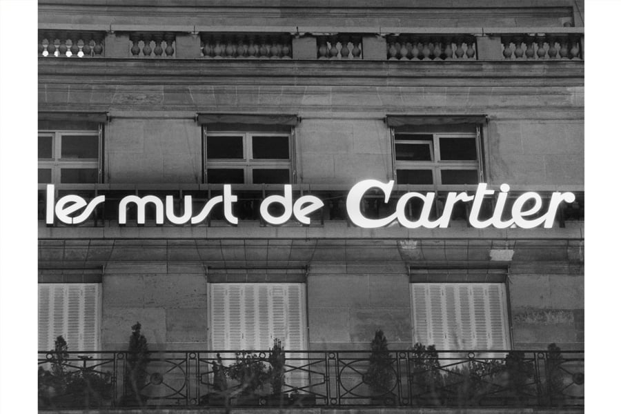
Les Must de Cartier logo on the façade of the building housing the headquarters in Paris at 44 Champs Elysées. © Cartier
“Aldo Cipullo had an incredible talent to live in the moment. He had a vison of what he had to create, he had the audacity to do it and Cartier backed his ideas. The two emblematic collections revealed his ability to use shapes and the meaning behind those shapes to create objects of desire,” explains Du Mesnil.
Cipullo and Cartier knew that jewellery had to have meaning. It was this mutual appreciation for creating beyond the physical that was crucial to their everlasting success. The Love bracelet, in particular, modernised the bond of love and how it was communicated through the vessel of jewellery. Diamonds were no longer the only symbol of commitment, and quickly, the union of two rigid arcs sealed together became both a show of strength, and an embodiment of powerful love to be defined by its wearer.
“The original design of the Love bracelet is linked to the symbol of giving oneself to someone else. The collection serves to seal love that transgresses convention. Although now Love is a classic, when it first debuted, it was quite avant-garde. The stark screws, oval shape and undeniable elegance establish the piece as a timeless tribute to love of all kinds. It is very rare to see one single design so strong and obvious, yet still sticking to the purity of lines and shape,” Du Mesnil continues.
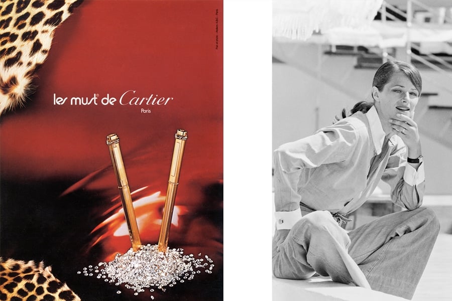
Left: Les Must de Cartier advertisement for the Oval pen, 1976, Les Ateliers ABC © Cartier. Right: Charlotte Rampling at the 1976 Cannes festival. She is wearing a Tank wristwatch, © AGIP/Bridgeman Images.
Cipullo’s approach to creation has since become very much part of Cartier’s design philosophy, ensuring modernity in the way we wear jewellery and a commitment to finding beauty wherever it may lie, which is an eternal source of inspiration for the Maison. Whether that comes courtesy of the humble screw or nail or is as vivacious as the spirit of the 70s, Cartier creations have always been distinguished by their character, boldness, and freedom. As have the men and women who have and continue to wear the Maison’s designs and perpetuate its values.
Frankly, the symbolism associated with Cartier says more about its icon status than words alone could adequately surmise. The Maison’s creations don’t need an introduction – you already know their story and you want to be part of that world. One that champions constant creative exploration, strong design and the capacity to evolve.
The French have a saying, “rien de trop” which translates to “nothing too much”. If there were only three words that could describe Cartier, these would be it. Central to having good taste is knowing when to stop – where to draw the line, how to set the boundary. Being able to take traditional and signature characteristics and stretch them just far enough. Never compromising on balance and proportion but teetering on the precipice until you begin to make a little noise.
For more, get to know our cover star Hannah Wick through RUSSH's exclusive model profile feature. And to experience the Taste issue from beginning to end, the September issue of RUSSH will be available on newsstands from September 2 and through our shop now. Find a stockist near you.


