
The colours we see and interact with every day are by no coincidence, a rhetoric we are familiar with since Miranda Priestly’s famous 'cerulean sweater' monologue in Devil Wears Prada. Miranda (Meryl Streep) teaches the world that every colour choice made is tactful and thought out, and inspired to evoke a particular emotion and feeling. It is with this same precision that people are bringing colour into their homes through interior design, with an emerging trend seeing all white walls and decor painted over with splashes of bold colour and considered colour schemes.
For your inspiration needs, the Dulux Colour Team are heralded as the experts for predicting what trends will influence Australian interiors for the year ahead (and have been for 25 years), having recently released its annual Colour Forecast for 2024. Led by Colour and Communications Manager Andrea Lucena-Orr and Colour Manager Lauren Treloar, the annual Dulux Colour Forecast is influenced by year-round research into the latest global and local trends, including fashion runways, trend reports and editorials, product and design launches, engaging with brands and reviewing customised research through extensive networks in the UK, Italy and France.
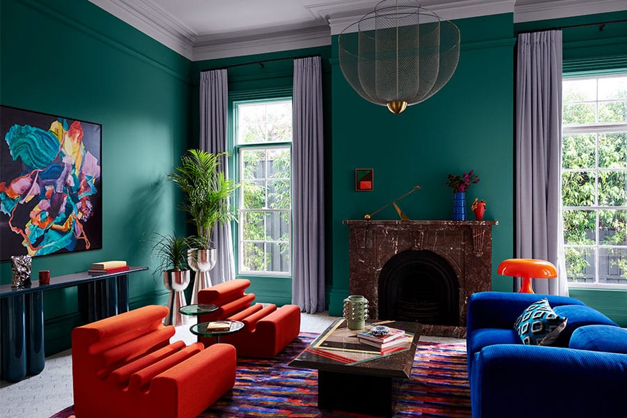
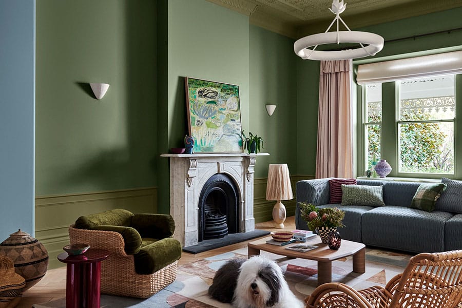
In 2024, our colour forecast includes three palettes, Solstice, Muse and Journey, carefully crafted to create a unified and exciting look for people to transform their own spaces. The Solstice palette takes influence from Scandinavian design and Mediterranean features filled with rich and organic hues, think rich browns and mellow neutrals. The Muse palette is more bold than the other palettes in this year’s colour forecast, taking heavy inspiration from the 60s through to the 80s, with the 70s free-spirited styles being a key influence. And the Journey palette takes influence from travel, bohemian charm and the art of craft at its core, to create an eclectic allure in a home.
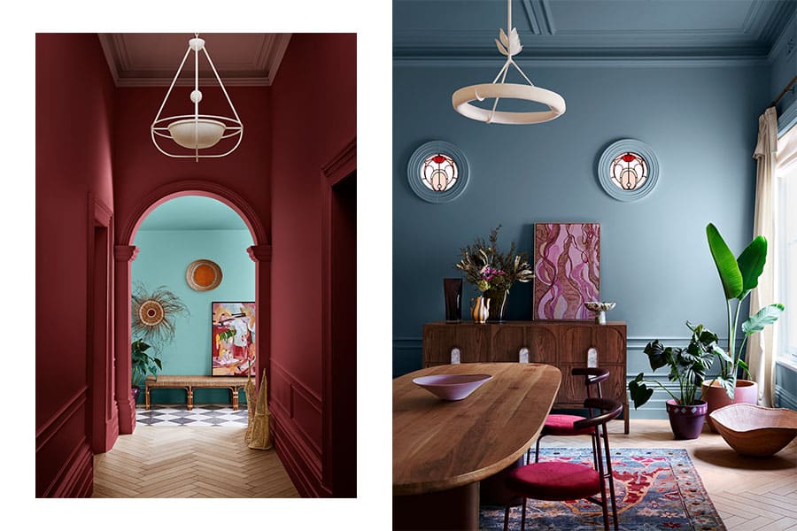
The Solstice palette: Reddy Brown, Potter’s Pink and Ripe Lemon

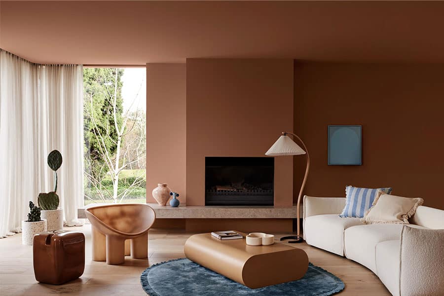
From this palette we see Dulux Reddy Brown particularly coming into fashion, as browns are back in a big way through interior styling, partly as they add warmth and energy to a space as well as creating a comforting and inviting feeling. This colour is perfectly suited for formal living spaces, hallways or the entry for a warm and welcoming feel. I recommend pairing this colour with warm whites and soft neutrals.
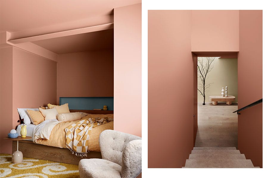
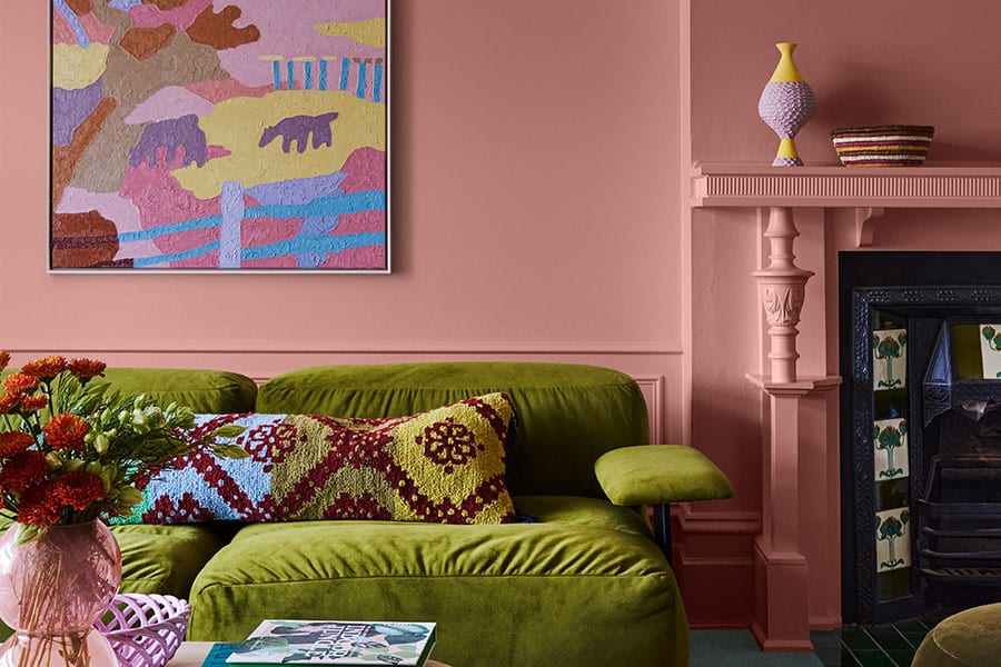
Dulux Potter’s Pink has been sought out for the calming and nurturing atmosphere it creates. Similar to Reddy Brown, this soft and welcoming terracotta pairs well with warm whites like Dulux Natural White™, and darker shades with richer undertones and striking accents, such as Dulux Empty Stage or Dulux Ocean Surf, also from the Solstice palette.
To brighten up a space, Dulux Ripe Lemon is the perfect warm and cheery shade to turn to. It's soft and pastel like, yet cheerful and vibrant. I recommend this shade for casual living areas, as well as doors, study nooks and to add light to a south facing space. As an accent colour, Dulux Ripe Lemon is best used to highlight soft furnishings, textural objects, or artwork.
The Muse palette: Guitar, Decoration Blue and Tuscan Sunset
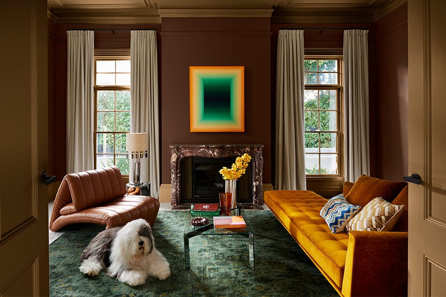
Again, through the Muse palette, we will see the rise in popularity of deep brown shades, with Dulux Guitar blending the warmth of earthy red tones with the depth and richness of chocolate brown. This shade provides a sense of relaxation and warmth, and complements vibrant colours, including Dulux Passionate Blue and wheat-coloured yellows such as Dulux Poached.
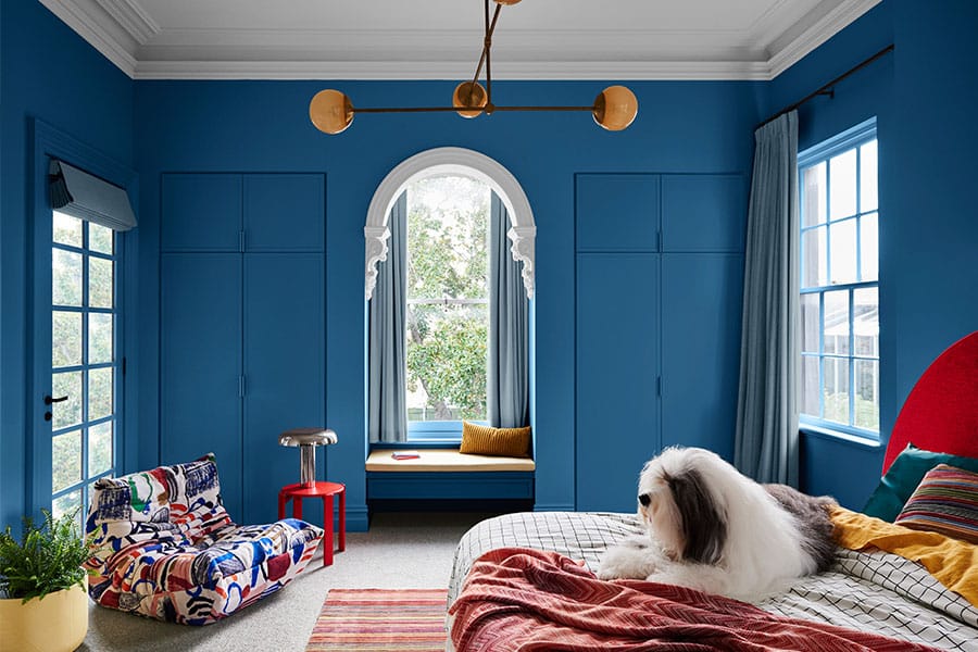
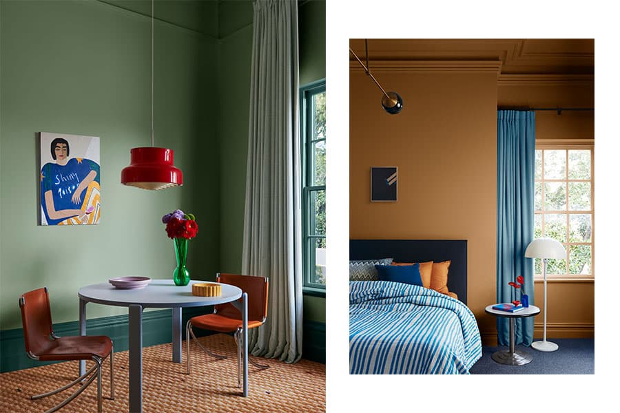
Shades of blue will be increasingly more popular as they help to create calmness and serenity in a space. Dulux Decoration Blue is a soft mid-tone blue, perfect for a feature wall or accent colour both inside and out. I recommend pairing this shade with whites and neutrals, darker shades of blue and green, or as a contrast, a soft yellow.
This warm earthy amber shade exhibits energy and vitality and can serve as an accent colour in or outside, as a backdrop colour or as an all-over wall colour to create a dramatic and cosy space. This shade pairs well with warm whites, neutrals as well as soft, warm neutral, like Dulux Clay Pipe.
The Journey palette: Clouded Sky, Bruised Burgundy and Bean Counter
Dulux Clouded Sky is a greyed-off mid blue that is well suited for living spaces, bedrooms, bathrooms and laundries, as it is a calming and soothing shade. It's a beautiful shade we can see being incredibly popular, as its quiet, soft and welcoming and an easy introductory colour to incorporate for people who are cautious with their colour choices in the home. I recommend pairing this with warm whites like Dulux Antique White U.S.A.® or soft neutrals and deep charcoal greys.
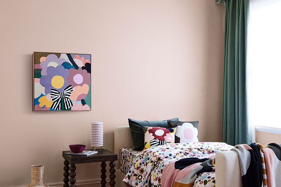
This is a deep, earthy and rich shade that exhibits an inner depth, sophistication and confidence, and is therefore perfect for a main bedroom and formal spaces. It is balanced beautifully with the subtle neutral pink of Dulux Lilac Light or warm, sandy 'greige' of Dulux Beige Artefacts.
This stunning and warm greyed-off green creates a peaceful, refreshing and abundant space, well suited for living areas and bedrooms. This shade is paired particularly well with warm whites, soft neutrals or lighter greens.


